PythonPro #16: PyTorch 2 Enhancements, Advanced CUDA Optimization, PEP 8 Guide, and Visualizing Data with Matplotlib
Bite-sized actionable content, practical tutorials, and resources for Python Programmers and Data Scientists
Welcome to a brand new issue of PythonPro!
News Highlights: Launching in March, PyTorch 2 will be introducing torch.compile and TorchDynamo for enhanced ML efficiency, detailed in an upcoming ASPLOS 2024 paper. Pascal Hartig discusses Meta's Python advancements on the Meta Tech Podcast.
In today’s Expert Insight we bring you an excerpt from the recently published book, Data Labeling in Machine Learning with Python, that takes you through the process of visualizing image data using Matplotlib using a practical example. Packt subscribers can start reading the book right away for free here. Not a Packt library subscriber yet? Here’s a newletter exclusive 50% off your first month.
Here are my top 5 picks from our learning resources today:
Dive in, and let me know what you think about this issue in today’s survey!
Stay awesome!
Divya Anne Selvaraj
Editor-in-Chief
P.S.: If you have any food for thought, feedback, or would like us to find you a Python learning resource on a particular subject for our next issue, take the survey!
We love taking requests. Any resource preceded by “👨💻” aligns with what our readers have asked for.
🐍 Python in the Tech 💻 Jungle 🌳
🗞️News
PyTorch 2 - Faster Machine Learning Through DynamicPython Bytecode Transformation and GraphCompilation: The PyTorch team's paper on PyTorch 2, set for presentation at ASPLOS 2024, introduces major updates including torch.compile, TorchDynamo for graph capture, and TorchInductor as a backend compiler for enhancing ML with dynamic Python bytecode transformation and graph compilation. Read to learn more.
Meta loves Python: This episode of the Meta Tech Podcast explores how Meta's engineers have significantly contributed to Python 3.12, introducing advancements like custom JITs and Immortal Objects. Listen to learn how and why Meta built these new features for Python.
💼Case Studies and Experiments🔬
👨💻Alignment of Unsupervised Machine Learning with Human Understanding: A Case Study of Connected Vehicle Patents: This study introduces a novel metric to quantify the alignment between subject matter expert (SME) classifications and machine learning (ML) topic assignments within the field of connected vehicle (CV) patent analysis. Read to discover a valuable tool for evaluating the alignment of ML models with human expert understanding.
File magic with the Python standard library: This article details the development of an application for efficiently viewing large log files, highlighting Python's capabilities in handling large datasets through memory mapping and selective file reading. Read to learn advanced Python techniques for projects requiring optimization for large data sets.
📝Listicles
10 Python libraries for your DataScience CV in 2024: This article covers tools that facilitate tasks from data cleaning and feature engineering to machine learning, and contribute to building efficient, high-performance data science projects. Read if you are exploring ways to make your CV more data science oriented.
10 Advanced Python Snippets to Elevate Your Coding Skills Like a Pro in 2024: The snippets included in this article cover a range of techniques including set operations for union, intersection, and difference; partial functions to fix arguments of a function; and memoization for caching expensive function calls. Read to enhance your ability to write cleaner, more efficient, and maintainable code.
📊Analysis
Why AI has a Python Problem: This video focuses on Python's inefficiency in server tasks, particularly for AI applications requiring high concurrency. Watch to learn about Python's strengths and limitations in AI development.
A Comprehensive Review of Replit's 100 Days Challenge: This article reviews Replit's 100 Days of Python course, which at the moment is free to access, highlighting its comprehensive structure, practical projects, and supportive learning environment. Read if you are looking for a hands on Python course.
🎓 Tutorials and Guides 🤓
Going Further with CUDA for Python Programmers: This video delves into optimizing CUDA performance, focusing on memory optimization, particularly using shared memory. Watch for a comparison of various approaches, including pure Python, Numba, and raw CUDA, showcasing a matrix multiplication example to illustrate the efficiency gains and development ease with Numba.
How to build a custom Python Docker image: This guide takes you through building a custom Python Docker image from scratch, addressing limitations of official Python images. Read to learn how to construct a tailored Docker image for Python applications, incorporating best practices for layering, dependency management, and environment configuration for scalable development.
A search engine in 80 lines of Python: This article focuses on addressing the discoverability crisis for small websites. Read to learn about the technical aspects and challenges of building a basic search engine from scratch, including crawling, indexing, and ranking algorithms.
Using Matplotlib To Create An Article Cover Mosaic Animation: This article covers preparing images, leveraging Matplotlib, NumPy, and Pillow libraries, setting up a grid, reading images into NumPy arrays, and the technical steps involved in animating the mosaic. Read to enhance your data visualization skills.
👨💻Python Back-End Development – Handbook for Beginners: This comprehensive guide to Python back-end development for both beginners and experienced developers, covers the essentials of building web applications, data analysis, and architectural design with Python. Read to identify the necessary skills for building efficient and scalable back-end systems.
🔑 Best Practices and Code Optimization 🔏
Counting CPU Instructions in Python: This article discusses using perf_event_open to monitor CPU instructions for Python code, revealing that printing "Hello" takes about 17,000 instructions. Read to learn about a method for accurately measuring CPU instruction counts in Python that results in a more consistent performance metric than time-based approaches.
👨💻How to Write Beautiful Python Code With PEP 8: This article explains PEP 8, the Python Enhancement Proposal that offers guidelines and best practices for writing clean and readable Python code. Read to learn how to write PEP 8 compliant Python code, understand the rationale behind PEP 8 guidelines, and set up a development environment that promotes writing clean code.
How to Delete a File in Python: This tutorial outlines various methods for deleting files in Python, emphasizing the importance of doing so carefully and with best practices in mind. Read to learn precise techniques and best practices for safely managing file deletion.
Darts Time Series TFM Forecasting: This article offers a detailed guide on optimizing Torch Forecasting Model (TFM) parameters for time series forecasting with Darts, a Python library. Read to gain insights into model optimization, data handling, and leveraging covariates for enhanced predictions.
👨💻Data Visualisation 101 - Playbook for Attention-Grabbing Visuals: This comprehensive guide on creating visuals with Plotly, focuses on three main steps: reducing noise, adding highlights, and providing context. Read to learn how to effectively communicate data insights through visual design.
Take the Survey, Make a resource request!
🧠 Expert insight 📚
Here’s an exclusive excerpt from “Chapter 4, Exploring Image Data” in the book,
Data Labeling in Machine Learning with Python, by By Vijaya Kumar Suda, published in January 2024. The book is a comprehensive guide detailing techniques for programmatically labeling diverse data types to unlock the full potential of data using Python libraries.
An example of visualizing data using Matplotlib
Let’s see an example of visualizing image data using Matplotlib. In the following code,
we first load the image using the PIL library:
import matplotlib.pyplot as plt
import numpy as np
from PIL import Image
# Load an image
img = Image.open('../images/roseflower.jpeg')
Then we convert it to a NumPy array using the np.array function:
# Convert image to numpy array
img_array = np.array(img)
Next, plot the result with the following commands:
# Plot the image
plt.imshow(img_array)
plt.show()
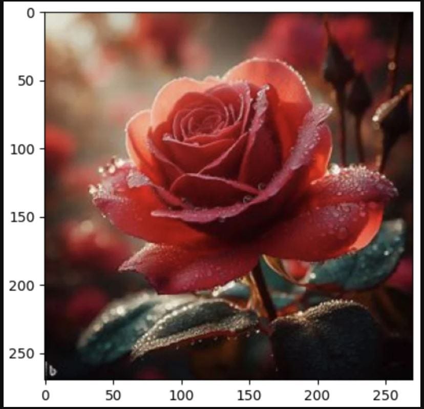
We get the following result:
Figure 4.1 – Visualizing image data
We then use the imshow function from Matplotlib to plot the image. Converting images to NumPy arrays during EDA offers several benefits that make data manipulation, analysis, and visualization more convenient and efficient. NumPy is a powerful numerical computing library in Python that provides support for multi-dimensional arrays and a wide range of mathematical operations. Converting images to NumPy arrays is common during EDA as NumPy arrays provide direct access to individual pixels in an image, making it easier to analyze pixel values and perform pixel-level operations. Many data analysis and visualization libraries in Python, including Matplotlib and scikit-learn, work seamlessly with NumPy arrays. This allows you to take advantage of a rich ecosystem of tools and techniques for image analysis.
There are many different ways to visualize image data using Matplotlib. We’ll now review a few commonly encountered examples.
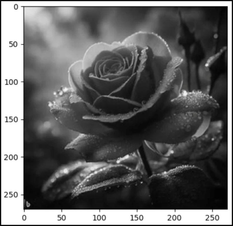
Grayscale image: To display a grayscale image, we can simply set the cmap parameter of the imshow function to 'gray':
import numpy as np
from PIL import Image
import matplotlib.pyplot as plt
img_color = Image.open('../images/roseflower.jpeg')
# Convert the image to grayscale
img_gray = img_color.convert('L')
# Convert the image to a NumPy array
img_gray_array = np.array(img_gray)
# Display the image using matplotlib
plt.imshow(img_gray_array, cmap='gray')
# Show the plot
plt.show()
The following figure is the result of this code:
Figure 4.2 – Grayscale image
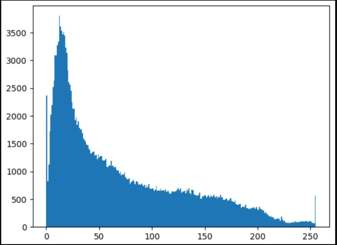
Histogram of pixel values: We can use a histogram to visualize the distribution of pixel values in an image. This can help us understand the overall brightness and contrast of the image:
import numpy as np
from PIL import Image
import matplotlib.pyplot as plt
# Load an image
img_color = Image.open('../images/roseflower.jpeg')
# Convert image to numpy array
img_array = np.array(img_color)
# Plot the histogram
plt.hist(img_array.ravel(), bins=256)
plt.show()
The resulting graph is as follows:
Figure 4.3 – Histogram of pixel values
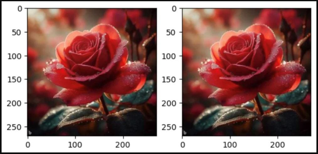
Multiple images side by side: We can use subplots to display multiple images side by side for comparison:
import matplotlib.pyplot as plt
import numpy as np
from PIL import Image
# Load two images
img1 = Image.open('./images/roseflower.jpeg')
img2 = Image.open('./images/roseflower.jpeg')
# Convert images to numpy arrays
img1_array = np.array(img1)
img2_array = np.array(img2)
# Plot the images side-by-side
fig, axes = plt.subplots(nrows=1, ncols=2)
axes[0].imshow(img1_array)
axes[1].imshow(img2_array)
plt.show()
We get the stunning result as follows:
Figure 4.4 – Multiple images side by side
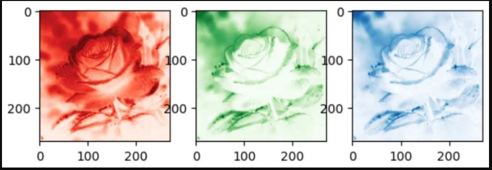
Color channel visualization: For color images, we can plot each color channel separately to see how they contribute to the overall image. In an image dataset, a color channel refers to a single component of color information in each pixel of an image. Color images are composed of multiple color channels, where each channel represents a specific color aspect or color space. The combination of these color channels creates the full-color representation of an image. Common color spaces include Red, Green, Blue (RGB), Hue, Saturation, Value (HSV), and Cyan, Magenta, Yellow, Key/Black (CMYK).
In general, RGB color channels are visualized using the appropriate colormap to represent their respective colors. When visualizing individual color channels (red, green, and blue) separately, it’s common to use colormaps that highlight the specific color information.
Here are typical colormaps used for visualizing individual RGB channels:
Red channel: The 'Reds' colormap is often used to visualize the red channel. It ranges from dark to light red, with the darker values representing lower intensity and the lighter values representing higher intensity.
Green channel: The 'Greens' colormap is commonly used to visualize the green channel. Similar to 'Reds', it ranges from dark to light green.
Blue channel: The 'Blues' colormap is used for visualizing the blue channel. It ranges from dark to light blue.
Here’s an example of how you might visualize individual RGB channels using these colormaps:
import matplotlib.pyplot as plt
import numpy as np
from PIL import Image
# Load a color image
img = Image.open('../images/roseflower.jpeg')
# Split the image into RGB channels
r, g, b = img.split()
# Convert channels to numpy arrays
r_array = np.array(r)
g_array = np.array(g)
b_array = np.array(b)
# Plot each channel separately
fig, axes = plt.subplots(nrows=1, ncols=3)
axes[0].imshow(r_array, cmap='Reds') # Use 'Reds' colormap for the red channel
axes[1].imshow(g_array, cmap='Greens') # Use 'Greens' colormap for the green channel
axes[2].imshow(b_array, cmap='Blues') # Use 'Blues' colormap for the blue channel
plt.show()
As a result, we see the following channels:
Figure 4.5 – Color channel visualization
Packt subscribers can continue reading the chapter for free here. Not a Packt library subscriber yet? Here’s a newletter exclusive 50% off your first month. You can buy Data Labeling in Machine Learning with Python, by Vijaya Kumar Suda, here.
On a scale of 1-10, how would you rate today’s issue of PythonPro in terms of being informative, engaging, and useful?
lowest 1 2 3 4 5 6 7 8 9 10 highest
And that’s a wrap.
We have an entire range of newsletters with focused content for tech pros. Subscribe to the ones you find the most useful here. The complete PythonPro archives can be found here.
If you have any suggestions or feedback, or would like us to find you a Python learning resource on a particular subject, leave a comment below!


